Designing
UX & interactions
User experience
& interaction design,
Project management
Vibe-ing: Smart textile tool for healthcare and well-being
Design of a wearable smart textile garment helping women in advanced age to improve their body posture via vibrotactile interactions.
Women in the age over 45 undergoing hormonal changes are not very often in the focus of the designers. However, experiencing a menopause is a natural part of every woman's life, and it brings several difficulties in women's feelings, emotions, and also physical abilities. Typical problems coming with the menopause include, besides other things, masculoskeletal problems such loss of bone density (osteoporosis), weakening of muscles, and consequently degradation of body posture.
Vibe-ing 2.0 is an extended version of the first version of Vibe-ing developed at the Eindhoven University of Technology. The Vibe-ing 2.0 consists of a smart textile garment with embedded custom-made 3D-printed vibrating modules and touch sensors made of a soft conductive embroidery. The garment registers when the users touch the embroidery, and responds by an appropriate sequence of vibrations helping them to be aware of their posture and correct the posture in their upper-back location.
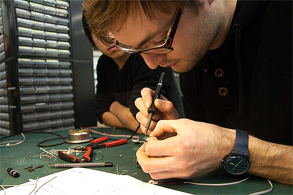
The project followed a user-centered design process consisting of initial research leading to requirements collection, followed by the ideation phase including brainstorming, informing the concept creation, later prototyping the concept end evaluating the prototype.
We gathered requirements based on the initial user research including voices of women representing our target group, and experts from the fields of gynaecology, rehabilitation and physiotherapy, and menopause consultants. Based on these requirements we generated a concept of the garment, and prototyped it to match the requirements and address the problem - the wrong posture and overall difficult time of women undergoing serious change in their life. The prototype included redesign of the dress itself, building the electronics including the vibrating actuators and textile touch sensors, and developing the interactions in a process of co-creation.

The fully working prototype was evaluated with physiotherapists and women representing our target users. The qualitative evaluation consisted of semi-structured interviews investigating their emotions, and associations related to the vibrotactile stimuli. Observation was focusing on their first reactions, physical interactions with the object, and reactions to the behaviour of it. Then, we also used the Love & Breakup letter method to find out people's deep emotions and relationship they built with the product.

The results were led to a set of recommendation for the following iteration cycle. The details of the work are described on the project blog at www.vibe-ing.com, and are submitted for a publication at selected conferences. Links to be added soon. The work contributed to the design community, and demonstrated that embedding vibrotactile interaction into smart textiles is currently feasible. Our fully working prototype is available for further exploration.

Used techniques:
Brainstorming, Interviews (multidisciplinary experts, users), Design concept derivation, Interaction design, Prototyping (textile, electronics, 3D print), Affinity diagrams, Personas, Observations, Love & Breakup letter technique, Qualitative analysis
Blog describing the project progress step by step: www.vibe-ing.com.
Vibe-ing team: Petr Kosnar, Dominika Potuzakova, Carmen van der Zwaluw, Indre Kalinauskaite, Derec Wu
HideStory Light
Design concept using Philips Hue for improving parents-child relationship through book-reading, based on qualitative User Experience research.
The overall goal of this project for the client (Philips Research) was to find new scenarios in which Philips Hue helps to provide unique user experience. We used various desigh research techniques to identify psychological needs tackled during book-reading when parents read together with their children (Relatedness - belongingness, Pleasure - stimulation, Security - control). Then we addressed these needs to improve the user experience for both the children and parents.

The concept describes e-reader application for tablets that allows controlling the Philips Hue lights in the room during reading. The light colour and intensity is set automatically at each page to match with the story in the e-book. For instance, if the story in the book takes place in the jungle, the lights turn green and weak, to help get immersed in the story. The light effect (light track) for the e-book can be embedded in the e-book from the publisher already, or it can be attached to the existing book (similarly like subtitles for a movie, for instance).

In this project we used Storify technique for identifying user emotions, needs and experiences, envisioning improvement of their experience of using the product. Furthermore, we used participatory design technique Co-constructing Stories for exploring and evaluation of our design concept in early stage.

Used techniques:
Brainstorming, Paper prototyping, Video prototyping, User interviews (children and parents), Storyboards, Storify, Co-constructing Stories
Story Light team: Petr Kosnar, Rian de Jong, Eveline Brink, Fereshteh Khodabakhshi
HideShop Assistant
Shop Assistant is a mobile app improving the shopping experience. Users can easily create a shopping list, and the app offers optimized shopping plan.
Shop Assistant application helps people to create and organize their shopping plan. Users can create a shopping list (adding items by typing, but also taking a photo of them, or scanning their bar code). Final shopping list is analyzed, and Shop Assistant offers price comparison of multiple shops in the neighbourhood, including a function of splitting the list into two different shops, if it minimizes the price.
Designing of the Shop Assistant application started with initial user research (survey and individual interviews with people from the target group) to specify and prioritize the requirements. Based on the results, we created story boards and a conceptual model of the app, and created quick low-fidelity paper prototype.
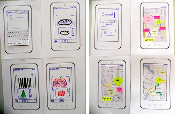
Testing the paper prototype revealed several design issues, that inspired us to improve the app in the second iteration of the design.

We tested the high-fidelity interactive prototype of the second version on a mobile phone with target users, and used the results of this test to create the third, final, version of the design.

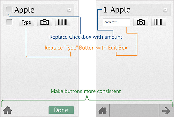
The final design was presented together with the detailed description of the screens, communicating not only the visual design, but also content, user flow, and interactions.
Shop Assistant team: Petr Kosnar, Den Tserkovnyi, Monica Perusquía-Hernández, Fereshteh Khodabakhshi
Used techniques:
Brainstorming, Qualitative user research, Storyboards, Paper prototyping, Digital prototyping (Axure), User interviews, Usability testing
Interactive prototype: shopassistant.faxe.cz
HideCustom Boards
The first and the largest Czech longboard brand producing fully customized longboards as well as supports longboarding in Europe.
Complete realization of the web presentation of a longboard and downhill skateboard brand.

Project characteristics:
- Company blog with CMS for publishing articles with photos, videos and other multimedia content
- E-shop
- Custom boards customizer (online tool for building own board from available components)
- Fully multilingual
- SEO
- Complete technical support to editors
- Cooperation on business and marketing strategy of the brand
Project website: www.custom-boards.cz/en/
HideFirst Aid Glass
Car accident. Injured people. How can you help?! With First Aid Glass the emergency center operator can guide you visually using augmented reality.
As Heartland Alliance disaster expert Charna Epstein once remarked, "Your true first responder is not going to be the police or fire department; it most likely will be the person sitting next to you on the bus, the person who shares your work cubicle or your next door neighbor.” But these people - although they are willing to do their best - often lack knowledge of providing proper first aid.
The concept of First Aid Glass describes two-way audiovisual communication through Google Glass and the interface of the display - i.e. how are the instructions given by the operator presented to the aider. Specifically, simplistic design reduces the provided information to minimum, focusing on colour-highlighting of the exact locations in the scene, such as a limb or wound on the body that must be secured.

Adding a visual modality into emergency communication improves the quality of the outcome of the situation in terms of time (i.e. aider understands and performs the assistance quicker), error rate (i.e. decrease in number of incorrectly understood or performed actions), and consequently survival rate of the injured (i.e. decrease in number of deaths caused by inappropriate or late first aid assistance). Moreover, the proposed system increases the comfort of both aider and remote assistant in the emergency situation. Specifically, the aider will perceive the presence of the expert at the place of an incident, which helps to cope with the stressful situation, and the aider receives valuable additional information about the injured person and the situation at the place which helps them to make more correct and faster decisions about the assistance.
First Aid Glass team: Petr Kosnar, Tetske Avontuur, Eveline Brink, Yves Florack
HideGuess What?!
Player-oriented and User Experience focused design of a game intended for two-minutes game-play time. You and your three colleagues survived a plane crash in a desert...
Design process:
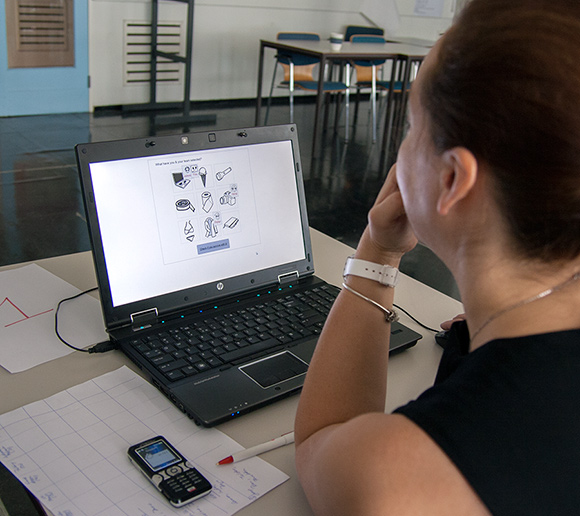
The goal of this one-week project was to design a game for two-minutes game-play time. The game design is focused on addressing player's emotions, and user experience. We decided for a puzzle game based on a surprise, fun, creativity, and player's knowledge of stereotypes. The game concept was created based on a brainstorming session, with regard to the playability aspects, player's need for control, and challenge of quick decision making in a short time. The basic idea was sketched in a story board and evaluated with game design experts. Then, the game was prototyped using HTML5, CSS, JavaScript, jQuery, and jQuery UI. The prototype was fully functional and playable, so that we were able to evaluate it in a user test and by a heuristics for playability (Heuristics for Evaluating Playability - HEP). As a result, we developed a functioning prototype of a simple game for limited game-play time and finished the projects with the conclusions drawn from the results of the evaluation in form of a set of recommendations for development of the real game.

Game Story line:
You are on a business trip to Cairo with three colleagues, which have different professions (salesman, photographer and programmer). Suddenly, the captain informs the passengers that the plane has to land forcefully in the Sahara. There is no time for discussion and everyone has the chance to grab only one item before leaving the plan. You know that surviving in the desert is hard, so you need to choose wisely. Your colleagues will choose only one item and you better choose one that is complementary to theirs, so that you all can survive together. Therefore, the players task is: To guess what the others might have chosen. The stereotypes of the different professions can be used as a hint for guessing their choice. Based on that, select an item that helps you – in combination with the other items – to survive.
User Experience:
The storyline is adjusted to the target user in order to create identification and make them play the game. Additionally, we generate curiosity about the choices made by your colleagues and about why the chosen items are useful at the desert. The fact that you have to choose blindly based on your assumption about your colleagues choice, is creating a challenge that suits our target group. We addressed human necessities of problem solving and creativity.
Interactive game prototype:
http://www.hci-books.com/guesswhat/
Used techniques:
Game Design, Storyboards, Brainstorming, Paper prototyping, Interactive Prototyping (HTML5, JavaScript, CSS, jQuery), Heuristic evaluation (HEP)
Team: Petr Kosnar, Monica Perusquia Hernandez, Hella Kriening; Coach: Regina Bernhaupt
HideProblem Slayer
Concept of a game helping people to communicate difficult subjects, such as illness, death, violence, or 'just' a relationship breakup.
The purpose of this game is to motivate people to communicate difficult situation in their lives, which helps them to cope with such situation, and feel relieved. Since mediated communication of sensitive topics is easier than in face-to-face situations, the game serves as a mediator between the person having a problem, and their friends or family members.

Project characteristics:
In the Problem Slayer game, one created a customized dragon, which is a representation of the problem. Then, the person creates a quest to defeat the dragon, and invites fellow fighters (friends, family members) into this mission. Then, they fight against the dragon (i.e. the problem) together, and – optimally – defeat it. During the fight, the person can communicate about the details and context of the mission (i.e. their difficult situation) with the rest of the team, and therefore shares the problem. The game is currently in the stage of a concept.
Problem Slayer team: Petr Kosnar, Barbara Wajda, Carmen van der Zwaluw, Tetske Avontuur
HideFree Magazine
Free Magazine is one of the most popular printed Czech magazines about board sports.
Complete design and development of a web page offering overview of current news aggregated from the partner websites (Freeride.cz, Skaterock.cz) and used for presentation of the Free Magazine.

Project characteristics:
- CMS for publishing articles with photos, videos and other multimedia content
- Connection to partner online magazines Freeride.cz and Skaterock.cz aggregating their content
- E-shop
- Online subscription orders
- Online contest management system
- Advertisement management system
- SEO
- Technical support to administrators and editors
Project website: www.freemagazine.cz
HidePsychology & Technology - TU/e
Psychology & Technology is a bachelor program at the Eindhoven University of Technology which focuses on relationships between people and technologies.
Complete design and development of the website.

Project characteristics:
- CMS Drupal customized for publishing articles, photos, videos and all the content of the website
- Online moderated Questions & Answers system
- Multilingual environment prepared
- SEO
Project website: www.ziejijhierietsin.nl
HideFreeride.cz
The biggest and most visited central European online magazine about extreme sports such as snowboarding, freeskiing, freestyle biking and surfing.
Realization of a complex news portal in a cooperation with the company - Refresh.

Project characteristics:
- A community section for registered users (public gallery, forum, ...)
- CMS for publishing news, articles, photo galleries, video galleries, quizzes, ...
- Calendar
- Navigator - overview of shops, snow parks and freeriding spots in a map
- Freeride TV
- Advertisement management system
- Search engine optimization (SEO)
- Technical support to administrators and editors
- International version on www.freeridemag.eu in English (currently stopped)
Project website: www.freeride.cz
Hide...and many more.
Research
in HCI
Qualitative
& quantitative research
Evaluating Peripheral Interactions
Quantitative and qualitative research evaluating the extent to which users are able to use device in the periphery of attention.
Summary

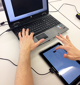
People typically interact with technology in a way that requires their attention - they need to focus on a display, keyboard, touch screen, or other interface. However, we can interact with many devices in the periphery. Think about situations when we need to perceive information from many sources simultaneously, but also perform several actions at the same time. Peripheral interaction is a new paradigm in HCI describing interaction with the technology in the periphery of our attention.
This research consisted of a combined quantitative and qualitative experiment evaluating the extent to which people can use devices in the periphery of attention. Since there has not been much research done in this field, we did not aim at measuring absolute level of attention, but compared different interaction modalities used in periphery. Specifically, we set up an experiment in which participants were occupied by a continuous primary task (on a computer), and were using a peripheral device - either a touch screen, or a graspable device called FireFly. Next to the interaction modality we compared also multiple levels of complexity of the interface, to determine the level of complexity that users are capable of using peripherally.
Results of the study are going to be published in the following months; the reference will be added here later.
Team: Petr Kosnar, Barbara Wajda, Den Tserkovnyi, Monica Perusquía Hernández. Consultants: Saskia Bakker, Jean-Bernard Martens, Jim Juola
HideFakebook - studying online behaviour of teenagers from inside
Naturalistic observation of online behaviour of teenagers from inside of their community; using a fake Facebook profile of a teenage girl.
Summary
Using a fake Facebook profile of a teenage girl I became part of community of teenagers, and had opportunity to study their online behaviour, the way they communicate, interact (with each other and the system), and what information they disclose to the public.
The results of this study are going to be presented at WebExpo Prague conference in September 2013 in Prague. During my presentation I will describe the methodology, as well as results and their relevance in topics of online trust, information disclosure, and social responsibility of providers of social network services.
Conference talk video: Fakebook by Petr Kosnar (Vimeo)
Results presented at WebExpo Prague 2013
HideSocial effects of touch in an immersive virtual environment
Research of gender differences in responses to mediated social touch – simulated physical contact – in a virtual environment.
Summary

In this study we investigated whether mediated touch (i.e. touch with its social effects transferred over a distance) can be considered as similar to non-mediated – real – touch. Demonstrating the similarity in patterns of responses to touch in mediated and non-mediated situations would provide evidence that mediated touch is perceived in similar way as non-mediated touch. This finding would let us incorporate touch as an additional modality in remote communication technologies (alongside of vision and hearing), which would increase richness of remote communication through this technology. Transferring a touch over a distance may also allow establishing a feeling of connectedness between two people, helping to recover from stress, play, or co-operate in virtual environments.
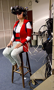
Based on the previous research in non-mediated situations, we selected two highly predictable effects of touch behaviour, and designed an experiment to test whether these effects would also occur in mediated situations. In particular, we focused on the gender differences in affective responses to touch, and to responses to touch applied to different body locations. Our experiment was conducted in an immersive virtual environment, which provided us with a possibility of full control of all conditions in the experiment.
The results of this study suggest that the similarity of the mediated touch to the non-mediated touch is limited, but present; this statement is supported with self-reported measures (i.e. answers of our participants to evaluating questions directly after the simulated touch), and also physiological measures (i.e. measuring skin conductance responses as an objective reaction of the body to received touch).
 Hide
Hide
Acceptance of a new technology in a home environment
The goal of the project called Living Together With an Avatar was to find the limitations of implementation of virtual avatar systems in home environments. The crucial aspect of such implementation was social acceptance.
Abstract

Avatar interfaces for intelligent agent systems are used in order to create a more pleasant and natural experience for the user. These avatars can be used as interfaces for systems that give feedback about energy consumption. In our research we have investigated how social feedback about energy consumption given by avatar influences users behavior. For this we use a series of qualitative research methods in which we simulate the interaction with such a system. We have also done in depth interviews and analysis of user impressions and experiences in order to extrapolate what the characteristics that make the avatar acceptable. We have discovered and investigated some of the aspects that were taken into consideration when discussed about the acceptability of such a system. The implications of our findings are important because they show some possible guidelines for future development of avatar interfaces.
HidePersuasive technology
Effects of social exclusion and gender combination of a person and an artificial agent, on perceived anthropomorphism and persuasion
Abstract
Previous research has shown remarkable differences between the influence of an artificial agent on males and females who are socially excluded than those who are included. The difference has not been explained and further investigated so far. The current study was done to enlighten this problem; we hypothesized that perceived anthropomorphism increases and people were more susceptible to persuasion by an artificial agent of the opposite gender, and also when they were socially excluded. A lab experiment with 86 participants suggested partial support for the assumption that people are influenced more by an artificial agent of the opposite gender. Positive effect of social exclusion on persuasiveness and interaction effect between social exclusion and gender combination of a person and an artificial agent were not supported. However, differences between interaction of males and females with a male and female virtual avatar respectively were found.
HideEffects of (natural) environments and light on human behaviour
Research investigated the combined beneficial effects of daylight and a natural view on health, mood, and cognitive performance of office employees
Abstract
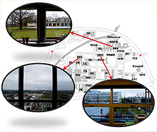
Research study has indicated that a view to a natural environment as well as daylight entrance can improve cognitive performance and mood. However, these studies almost exclusively focus solely on either the effects of view content or the effects of daylight and were mostly performed in a lab setting. This research simultaneously investigates the effects of daylight and a view, direct and mediated by mood, on cognitive performance by conducting a field study. The study consisted of an online questionnaire and measurements of room specifics. Both instantaneous and general effects were investigated in this research. Results show that a more natural window view has a positive effect on instantaneous cognitive performance and mood, while general cognitive performance is positively influenced by mood, which is positively influenced by the amount of daylight.
The project was presented on the 9th Biennial Conference on Environmental Psychology, 2011 (Authors: F. Beute, Y.A.W. de Kort, T.J.M.M. Elsten, M.W.M. van Esch, P. Kosnar & D. Wang).
Extended abstract: http://proceedings.envpsych2011.eu/files/doc/308.pdf
HideLecturing
& talks
Spreading the knowledge and experience
The Client Said: "These kids need to live longer." at Interaction19
How do you design a tool for children with a rare genetic disease?

Description:
“My daughter has to live longer,” that was the assignment from the client. Sarah was born with a rare genetic disease, cystic fibrosis, that requires a demanding daily therapy and radically shortens life.
There were only 200 people in the target group of this project, the business potential was minimal, and the context of serious diagnosis made the routine UX activities extremely challenging.
Talk detail: Interaction 19 Talk description
Video: Talk recording at Vimeo
HideRobot at Creative Mornings PRG
Are we humans? Or are we robots? Or… are we something in between?

Description:
It has been a while since Karel Čapek first introduced robots in his play R.U.R. Our speaker Petr Kosnar talked about how they have become our regular companions and the influence they have had on our social lives.
Feedback
"We're already #cyborgs" says @faxecz in his great talk at @Prague_CM http://t.co/AR3LMyjzyX
— Jakub Rafaj (@jakub_rafaj) June 18, 2015Talk detail: http://creativemornings.com/talks/petr-kosnar/
HideRise of Human-Like Interactions at EuroIA 2014
How do we interact with computers, and how is it different from interacting with humans? Is it actually different? Why?

Description:
The goal of this talk, given toghether with Jiri Sekera, is to present the main differences of human-computer interaction and human-human interaction. We compare the languages of interaction between humans and between humans and technologies, and point out that interactions with technologies (not only websites) could be designed and implemented more human-like.
We demonstrate that information needed for understanding context are actually easily available nowadays. Then, the designers should take this opportunity, and use these information and design systems that communicate with users in more human-like way, not as a dumb question-answer machine. When we minimize user interventions and maximize utilization of context-aware technologies, the interactions will be more pleasant for the users, and their goals will be achieved faster.
Feedback
@signalizer @faxecz Thanks for the talk, guys. Really well thought out. :)
— Francis Rowland (@francisrowland) September 27, 2014Enjoyed the spirit of @signalizer & @faxecz's talk at #euroia. Get away from designing visual interfaces, think about APIs and information!
— Paul Rissen (@r4isstatic) September 27, 2014Don't be stuck with the #UI, Look around and #design for the present! @faxecz & @signalizer #euroia #sketchnotes #ux pic.twitter.com/YcjjobaZUV
— Nádia Ferreira (@NadiaNadienka) September 29, 2014Talk detail: EuroIA Talk description
HideOpen Lecture at CIID
The Future of Designing Human-Technology Interactions

Description:
Looking at the history of interaction design, we could notice that the ways we interact with technologies are growing more complex and rich. Not only that: our technologies interact with us – they can be aware of our actions, learn from us, and perceive the world around like never before.
In such an emerging environment, designers have increasing freedom to design meaningful interactions that utilise the capabilities of the latest devices.
What is the future of man-machine interaction? What is the role of an interaction designer in that story? Will our interactions with technologies be similar to our interactions with each other? And should we learn to adapt to the world flooded by all kinds of technologies, or should we attempt to make technologies adaptable to our lifestyles? Is this the task for an interaction designer?
Slides: The Future of Designing Human-Technology Interactions /Open lecture CIID/ from Petr Kosnar
Feedback:
Wonderfully insightful lecture on the future of interaction by @faxecz at #CIID #Copenhagen
— Eric Reiss (@elreiss) August 13, 2013
Lecture details: CIID Open Lecture description
HideFakebook at WebExpo Prague 2013
Facebook, social experiment, life online, trust, information disclosure, teenagers, social responsibility. Fakebook.
Description:
Once upon a time there was a 14-years old girl who just proudly created her Facebook profile. But this girl was not an ordinary girl.This girl was a very special girl. She never existed in real life. Her whole life was purely virtual. But her friends were real...
Listen my story about creating and maintaining a fake Facebook profile of a teenage girl. I will tell you about her friends and their online behaviour that I observed during past 2,5 years. I was shocked seeing what all they shared with unknown people, and how much different their online life was from what I expected.
Feedback:
Brilliant talk from @faxecz who used a fake #Facebook account to explore FB's dark side #wxprague http://t.co/E0vPrUutSq
— Polle de Maagt (@Polledemaagt) September 20, 2013
Beating @faxecz talk will be almost impossible for other speakers. #awesome #wxprague
— Filip Procházka (@HosipLan) September 20, 2013
Kick-ass presentation by @faxecz #wxprague
— Jeanne Trojan (@jmtcz) September 20, 2013
Video: Fakebook by Petr Kosnar (Vimeo)
Talk details: WebExpo Prague 2013
HideNorth Carolina State Univesity
University course: UX Design Studio
Description:
Practically oriented intensive course (9 hours / week) guides students through complete design process following the principles of Human-Centered Design. Apart from the theoretical foundations of design, research, and related topics of psychology they acquire wide spectrum of methods and tools for designing user experiences and meaningful digital and tangible products and services.
Details: NCSU: Prague Institute
HideSeduo.cz
Online course: Human-Centered Design
Description:
Co-authored online course about Human-Centered Design on the Czech MOOC platform Seduo.
Nineteen lectures in Czech language provide free introduction into the field, explaining basic principles and methods of Human-Centered Design.
The course and all the supportive materials are in Czech language.
Feedback:
Perfektní videokurz a ZDARMA - Human-Centered Design: Design zaměřený na člověka http://t.co/w6zRfqeqyn od @faxecz a @signalizer #HCD
— Jan Kvasnička (@Jan_Kvasnicka) July 22, 2015
Fajn videokurz Human-centered designu pro začátečníky od @signalizer a @faxecz: http://t.co/9rQ9pGIgPB. Krátké lekce, snadno stravitelné.
— Marek Prokop (@MarekP) August 4, 2015
HCD kurz na Seduo doporučuji http://t.co/QN8QJy0Iub Je to dobrý a srozumitelný úvod. Supr práce @signalizer a @faxecz!
— Petr Kozlík (@goatsman) July 24, 2015
Course page: Human-Centered Design: Design zaměřený na člověka
HideSeduo.cz
Online course: User Testing / Uživatelské testování
Description:
Co-authored online course about user testing on the Czech MOOC platform Seduo.
Twenty four short lectures teach principles of user testing, demonstrate the best practices on examples, and show how major Czech companies conduct remote usability testing, guerilla research, and testing in a usability lab.
The course and all the supportive materials are in Czech language.
Feedback:
Super pro všechny, kdo se chtějí naučit testovat! #ux #ut https://t.co/D6v2hpotmW
— UXZ konference o UX (@UXZ_CZ) May 24, 2016
Course page: Uživatelské testování
HideUniversity of Economics
University course: Human-Centered Design & Communication Design
Description:
Extra-semestral course covers the complete Human Centered Design process. Practical hands-on work on real problems teach the principles of user research, design requirements, ideation techniques, creating design concepts, prototyping, and evaluation. Students are lead to make reasoned design decisions, and address real user needs with designing meaningful products.
Details: Course page
HideUX Camp Berlin 2016
Making things memorable.
Description:
Five years ago I run a session about memory, and the strategies to make things memorable. I was wearing a banana costume during the whole session to demonstrate that this silly detail will make people remember the session even after years. So... now the "even after years" is here, and I run the very same session again, just introduced by an overview of all the attention I got only because I was wearing the banana costume. And guess what - most of the people actually did remember me from 5 years back! (unlike other sessions that they could hardly recall). Quod erat demonstrandum.
Feedback:
This is the way to pitch a session called 'How to make things memorable' #uxce16 #ux pic.twitter.com/1eImw0YFe9
— Chris Constantine (@chriscon) June 25, 2016
Wow. That @faxecz is totally banana. Great talk. Great examples. Great inspiration. #blackcat #banana #uxce16 pic.twitter.com/LLiPsRC7UT
— Sebastian Paul (@herrp) June 25, 2016
HideBannana guy strikes back! Memorable @faxecz at #uxce16 pic.twitter.com/wljG6z0ZEN
— Zdeněk Lanc (@ZdenekLanc) June 25, 2016
UX Monday Prague / Oct 2016
Workshop: Information visualization - how to work with the meaning of data in user interfaces
Description:
Information visualization is not a topic relevant only for visual designers. Practical workshop describes the techniques of designing user interfaces that are ultimately clear, easy to understand and convey the right information. We focus on the core meaning of the information to enable efficient interaction of the user with the interface.
Feedback:
Díky @faxecz za super workhop - jak pracovat s významem dat v UI! #uxmonday pic.twitter.com/nrOHWR3tSz
— Honza Murin (@honzamurin) October 11, 2016
Details: Workshop page
HideMBPFW: #FASHIONTECHCZ 2015
From personal computers to wearables

Description:
How technology enabled shifting from personal computers to wearables and sensors-powered smart products.
Feedback
Jsem z #fashiontechcz nadšená, po přednášce Petra Kosnara přemýšlím, jaké wearables by tak využili bsristi? Acaia 2.0?
— Terezka Bala (@Terezzzka) March 19, 2015Report at Lupa.cz: http://www.lupa.cz/clanky/fashiontech-nejvetsi-propagatori-wearables-jsou-batman-a-michael-knight/
Report at Tyinternety.cz: http://www.tyinternety.cz/startupy/svet-wearables-se-ukazal-v-cesku-jak-vypadaji-nositelne-technologie-co-musi-mit-aby-tu-uspely/
Report at Modeschau / Český Rozhlas: http://prehravac.rozhlas.cz/audio/3346124/embedded
Event website: http://www.fashiontech.cz
HideUX Monday Prague / Jul 2015
Workshop: Designing UX concept
Description:
Practical workshop of creating a design concept that purposefully triggers specific desired human emotions. The first step is to identify the human needs we want to aim at, and then address them through the design.
Feedback:
Perfektní workshop designování ux konceptu na #uxmonday v @h1cz aneb důchodce Kamil a jeho superchytré zvonko-hodinky pic.twitter.com/b0Nt6yQo7H
— Viola Kratochvílová (@posypusipusu) July 20, 2015
Další super workshop od @asociaceux o navrhování UX konceptů s @faxecz pic.twitter.com/AZGZs9jGgk
— BoB Marvan (@BoBMarvan) July 20, 2015
"Neexistuje inovativní exekuce, pouze inovativní koncept. Aneb hovno nevyleštíš." @faxecz pro @asociaceux pic.twitter.com/BwJhf5aAPZ
— Jiří Sekera (@signalizer) July 20, 2015
Details: Workshop page
HideConversion Meetup 2013
Designing User Experience, Not User Interface

Description:
User Experience is not only about web sites and creating wireframes of User Interfaces. UX is something that happens in the user’s mind – a mixture of feelings and emotions, such as satisfaction and frustration, memories, or reflection of one’s own expectations. This talk presents tools and methods that a UX designer can use for designing the UX, regardless of the form of the actual product – if it is a web site, service, or a tangible device. The talk described how to use storytelling techniques and video prototyping to design UX, not saying any single word about the User Interface. The techniques were be demonstrated on a case of designing a new experience using Philips Hue - an existing device, that was already on the market.
Slides: Designing User Experience, Not User Interface /Conversion Meetup 2013/ from Petr Kosnar
Talk detail: http://www.conversionmeetup.net/portfolio/petr-kosnar-iampetr-com/
HideUXcamp Europe 2013
Buttons suck! ...and the other UI elements are not much better.

Description:
This talk explains why buttons suck, and other truths about ancient UIs & interactions that do not utilize possibilities of current techologies. I suggest to stop automatically using oldschool established UI elements in all those cases where it does not really have any advantage. Current technology allow us to design way more natural, rich and meaningful interactions - such as direct manipulation on a touchscreen. If the market is currently flooded by all kinds of devices equipped with large multi-touch screens, accelerometres, gyroscopes and other sensors, why do we still keep using oldschool UI elements such as buttons for controlling mostly everything? There is a design space for new kinds of interactions. Start using it, and don't be stuck with all the design patterns from several years ago that emerged around devices with totally different interaction capabilities.
Slides: http://www.slideshare.net/faxecz/buttons-suck-uxcamp-europe-2013 from Petr Kosnar
Feedback:
At a UX camp, you can get lots of great discussion from talking about kitsch (@luxux) and buttons (@faxecz)! #uxce13 #ux
— Karen Mardahl (@kmdk) June 23, 2013
Great talk: Buttons suck! /UXcamp Europe 2013/ by @faxecz on @slideshare #humancomputerinteraction #interactiondesign http://t.co/o6RckJGqEI
— Simon Theis (@simontheis) June 25, 2013
Hide@faxecz nice! I really liked your session, it's interesting when people rethink about something so it can be improved
— Xabi B (@xblsr) June 23, 2013
VI. UX Circus Show
I won the VI. UX Circus Show with my talk about a need for a blend of design being done in industry and in academia.

Description:
The talk suggests critical thinking leading to creativity instead of just following best practices and known solutions without understanding the reasoning behind them. There is huge amount of design and research being done in academia, and a myriad of new solutions for everyday problems that have been "just" explored and conceptualized and were never used in industry. If (industrial) designers use academic publications, conferences and exhibitions as a source of inspiration for their work, they would design better products in terms of novelty, innovativeness, and also functionality in many cases. Blending of industrial and academic design & research is a key for growth and progress in design.
Talk detail: http://www.uxcircus.cz/prezentace/jedna-pani-povidala
HideUX Camp Prague 2013
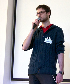
Session presenting broader view on User Experience. The title was "UX Revised", which was also the central theme of the whole event.
Description:
Since in the Czech environment the term "UX" is almost exclusively used in relation to webdesign, I felt urge to make clear the breadth of a presence of UX in so many other relevant disciplines. Further, I presented an overview of elements of User Experience and basic approach to tackle them.
Slides: http://www.slideshare.net/faxecz/ux-revised-ux-camp-cz from Petr Kosnar
HideUX Monday Ostrava #2
Design workshop focused on the role of UX in the User-Centered Design process.
Description:
The initial lecture explained the basic principles of User-Centered Design (UCD), and User Experience (UX), and introduced practical methods and tools used by designers during the design process. Then, participants worked in teams of 4-5 people on one of the given design challenges during practical workshop, while I was mentoring and supervising them. Teams presented and discussed the final designs in the end of the event.
Slides: Úloha UX designu ve vývoji produktů /UX Monday Ostrava/ from Petr Kosnar
HideUXcamp Europe 2012
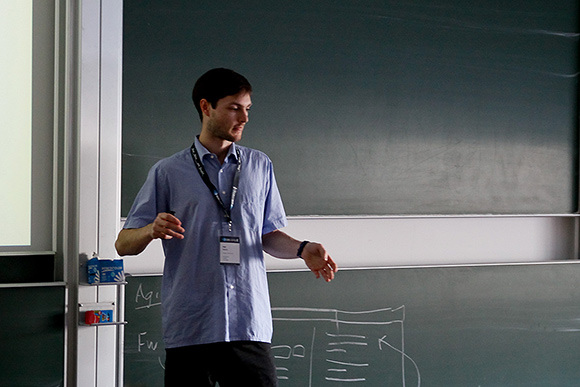
The Future of Communication Technology - Rich multisensory social interactions on a distance.
Description:
The future of communication technology as I envision it is in rich multimodal interaction utilizing immersive virtual environments to induce the feeling of co-presence with the people who are actually distant. Using immersive virtual environmnts also allows utilizing more modalities in remote communication - not only audio and vision (being a standard nowadays), but also several non-verbal communication cues such as interpersonal distance, or social touch.
Slides: The Future of Communication Technology /UXcamp Europe 2012/ from Petr Kosnar
Slideshare hot presentation:
Hide'The Future of Communication Technology /UXcamp Europe 2012/' by @faxecz is featured on our homepage. http://t.co/Y8P6BatR7g
— SlideShare Today (@SlideShareToday) September 9, 2013
WebExpo Prague 2011
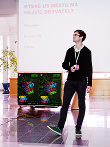
Decide About the Decision of Others
Description:
This talk introduced the topic of decision making especially to those designers who never came across this part of psychology. There were several ways of handling the decision-making demonstrated. The theoretical background as well as the practical application of these techniques in a web design was shown. The main goal of this talk was to demonstrate that decision-making processes are often explored in a great detail and described as a topic which has a great potential of application in (not only interaction) design.
With over 200 registered attendees it became one of the most popular and desired talk on the whole conference. The rich and very positive feedback from the audience ensured me that the topic was explained well and encouraged people to explore decision making field further. Therefore can conclude, that the goal of the talk was achieved great.
Slides: http://www.slideshare.net/faxecz/decision-making-9431336 from Petr Kosnar
Feedback:
2nd day of #WebExpo: really great. Most beautiful experiences included talks of @faxecz, @JanSru, @fczbkk, @smashingmag & @pboersma. Thanks!
— Jan Martinek (@endlife) September 25, 2011
Talk detail: Talk detailhttp://webexpo.net/prague2011/talk/decision-making/
Conference resumé: http://www.youtube.com/watch?v=RqKVFr1C9JY
HideUXcamp Europe 2011
My session at UXcamp Europe 2011 was about memory and memory strategies. I was presenting in a banana costume. (yes. for a reason.)

Description:
The session described the principles of a human memory, showed examples how people use different types of memory, and also demonstrated several memory strategies that can be used for better memorizing the given information. I presented the whole lecture in a banana costume, not only to attract the attention during the presentation pitch, but also to demonstrate one of the features of the human memory - that unexpected and absurd situations are remembered better than other. A year later - on UXcamp Europe 2012 during the presentation pitch I asked who remembers me from the last year, and the strong response from the audience ensured me that my demonstration worked very well.
Slides: http://www.slideshare.net/faxecz/memory-9431373 from Petr Kosnar
HideUniversity course: Advanced Website Creation
Created and taught a course for website designers and coders at the Faculty of Nuclear Science and Physical Engineering, Czech Technical University in Prague
Description:
This course extends the current courses taught at the Faculty of Nuclear Science and Physical Engineering and specializes in the quality and cleanness of the code, accessibility, compatibility and optimization for search engines and public usability.
The course goes in 11 lectures through advanced methods of building modern websites, describes the principles of writing well-styled semantic code with good structure. The thesis also describes rules for accessibility for handicapped users, usability and intuitive using of the whole website. Furthermore the thesis deals with the advanced application of cascading style sheets (CSS) and optimization of the pages for various web browsers, platforms and devices. Besides, the large part of the thesis describes the theme of search engine optimization (SEO). The methods of analysis of the optimization, described available tools, ways of optimization and hints for choosing the appropriate strategy for propagation the web in a competitive environment are also mentioned. Particular techniques leading to effective search engine optimization are mentioned as well.
During the running of this course the high quality of materials was proven and high popularity and very positive feedback from students was received. Professors and lecturers from the faculty who were inspecting several lectures also reported very positive feedback. This practical part brought me a pedagogical experience and helped to the faculty in following the latest technological trends by opening this course based on actual information and practical projects and experiences.
Course website (outdated, the course is currently not taught by me): http://www.fjfi.cz/wbk/
HideLecturing at Else AZ
Lecturer of a professional training focused on a website usage in the marketing, brand propagation and web project development organization.
I am responsible for the preparation and lecturing decision makers of big companies on what to ask for and what to expect from web designers. The course focuses on online marketing, search engine optimization (SEO), requirements for a successful, accessible and usable website, and web-project management. The attendees are interactively involved in the lecture so that they learn many of the principles on real examples from their own business.
Course website: http://www.elseaz.cz/.../making-your-company-website-visible/
HidePublications
& in media
Contributing to the innovation
Featuring in the Information Visualization by Robert Spence
My 3D representation of a family tree was described as a demonstration of alternative canvases.
The third edition of the famous book known as "the Bible of Information Visualization" to some, written by Robert Spence, one of the leading researchers in the domain, describes basic and advanced methods of visualizing information. One of the chapters focuses on alternative canvases, meaning visualizing information on other media than paper or screen. My prototype of a 3D representation of a genealogical tree demonstrates possibilities of displaying different information when viewed from different angles.

Book: Information Visualization: An Introduction
HideDesigning for emotions: the role of UX
Article describing how to address specific emotions through product properties, and what is the essential goal of a UX designer.
Article in Czech language.
Article: http://www.czechdesign.cz/temata-a-rubriky/jak-designem-vyvolat-emoce-role-ux
HideDesigning for emotions: UX concept
How to define what product properties trigger concrete emotional response? The key is a solid UX concept. How to create one?
Article in Czech language.
Article: http://www.czechdesign.cz/temata-a-rubriky/jak-designem-vyvolat-emoce-ux-koncept
HideVIBE-ING 2.0: a smart textile tool for healthcare and well-being
Authors: Kosnar, P., Zwaluw, C.S. van der, Kalinauskaite, I., Potuzakova, D., Wu, D. & Tomico Plasencia, O. (2014): Proceedings of Ambience`14 & 10i3m : Scientific conference for Smart and functional textiles, Well-Being, Tampere, Finland
Abstract
Vibe-ing 2.0, a smart textile garment, was designed to support wellbeing and self-care of (post-)menopausal women via vibrotactile stimuli on the body. Since osteoporosis and posture problems are common problems of women in and after menopause, the garment focuses on helping the posture correction. Vibe-ing 2.0 contains vibrating motors placed along the spine and in abdominal area, to stimulate the muscles affecting body posture. To enable user interaction, touch sensors were placed in the abdominal area. Two physiotherapeutic practices commonly used for posture correction – manual guidance and postural taping – were translated into two vibrational patterns (bottom-up, bidirectional), and were tested with nine women in qualitative user studies. Results showed that the bottom-up pattern was strongly preferred, largely due to its predictability inducing sense of control and comfort. Additionally, general design considerations for designing interactive smart textiles are discussed, as well as the aspects of vibrations relevant for designing vibrating patterns.
Keywords:
Smart textiles; vibrotactile interaction; menopause; well-being
Conference website: http://www.ambience14.fi
HideBridging the gap between the home and the lab: A qualitative study of acceptance of an avatar feedback system
Authors: Ruijten, P.A.M., de Kort, Y.A.W., & Kosnar, P. (2012). In: M. Bang and E.L. Ragnemalm (Eds.): PERSUASIVE 2012, Lecture Notes in Computer Sciences 7284, pp. 251–255, 2012.
Abstract
Avatar interfaces for intelligent agent systems are used in order to create a more pleasant and natural experience for the user. These avatars can be used as interfaces for systems that give feedback about energy consumption. In our research we have investigated how social feedback about energy consumption given by avatar influences users behavior. For this we use a series of qualitative research methods in which we simulate the interaction with such a system. We have also done in depth interviews and analysis of user impressions and experiences in order to extrapolate what the characteristics that make the avatar acceptable. We have discovered and investigated some of the aspects that were taken into consideration when discussed about the acceptability of such a system. The implications of our findings are important because they show some possible guidelines for future development of avatar interfaces.
Conference schedule: http://www.ida.liu.se/conferences/persuasive2012/papers.php
HideFraming well-being: The combined beneficial effects of daylight and a natural view on health, mood, and cognitive performance of office employees
Authors: F. Beute, Y.A.W. de Kort, T.J.M.M. Elsten, M.W.M. van Esch, P. Kosnar & D. Wang (2011). Proceedings: 9th Biennial Conference on Environmental Psychology
Abstract
Qualitative research has indicated that a view to a natural environment as well as daylight entrance can improve cognitive performance and mood. However, these studies almost exclusively focus solely on either the effects of view content or the effects of daylight and were mostly performed in a lab setting. This research simultaneously investigates the effects of daylight and a view, direct and mediated by mood, on cognitive performance by conducting a field study. The study consisted of an online questionnaire and measurements of room specifics. Both instantaneous and general effects were investigated in this research. Results show that a more natural window view has a positive effect on instantaneous cognitive performance and mood, while general cognitive performance is positively influenced by mood, which is positively influenced by the amount of daylight.
Extended abstract: http://proceedings.envpsych2011.eu/files/doc/308.pdf
HidePetr Kosnar’s Facebook Fake Out
Interview for Expats.cz about privacy on social networks, and Fakebook experiment studying behaviour of teenagers on Facebook.
Featuring in the book Sketchnotes 2011
Eva-Lotta Lamm captured my talk about the human memory at the UXcamp Europe 2011 in a form of a sketchnote and published it alongside with others in this wonderful collection of visual notes from inspiring UX and design events.
This book gathers Eva-Lotta's sketchnotes from over 100 talks taken at design events and conferences in 2011. Sketchnotes are visual summaries created in real time during a lecture. They invite the viewer to revisit, remember and re-discover the main thoughts and ideas of the speaker after the talk. The book includes sketches from events like d.construct, Future of Web Design, Typo Berlin, Typo London, UXLX, Flash on the Beach, UXcamp Europe, LondonIA, Frontend Oslo, The Story, The Design of Understanding, Creative Mornings, and many more.
Book website: http://www.sketchnotesbook.com
HidePhotography
& post-production
Art & beauty
of a light
Let's do a business together!
Petr Kosnar
Email: hello@iampetr.com
Website: IamPetr.com
Billing address:
Vřesová 264
252 43, Průhonice
Czech Republic
Business Registration Number: 74328221
VAT number: CZ8605230744


